Creating Your Business Logo With A Recognizable and Unique Brand Identity
Whether your business is just getting off the ground or you own an established business wanting to rebrand, the first step to creating your business logo is designing a recognizable and unique brand identity. However, creating a business logo isn’t as simple as it might seem. While creating your business logo, it’s always a good idea to first understand the basics of logo design to ensure your business logo is up to scratch.
What Makes a Good Business Logo?
Memorability
A key aspect of a good logo is that it is memorable from the very first time you see it. You see, the goal of creating a business logo is to create a connection with a consumer and generate interest in your brand.
When consumers can easily recall your business logo and brand, they are more likely to connect them to your company. This means that logos that are easy to remember and produce a strong impact are valuable because they help your brand stick in consumers’ minds.
Memorable logos combine many of the elements discussed above and they are the best way to communicate your brand’s personality and tone clearly and cohesively. A memorable logo should always strive to be unique. Even in industries where there are standards and common norms for designs, your logo should always aim to stand out from the pack as much as possible.
Relevancy
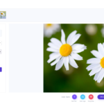
What all great business logos share is their relevancy to the markets their companies target, and how clearly they communicate a brand’s personality and identity. A primary component is the use of colors in your logo, which can trigger different emotions and show
![]() your brand’s personality to consumers. A company that sells toys for children may choose bright colors that communicate energy, fun, and excitement.
your brand’s personality to consumers. A company that sells toys for children may choose bright colors that communicate energy, fun, and excitement.
Font
The second important component is the font used in the logo or wordmark. Fonts help communicate your brand’s tone and its values, which ultimately help define your personality.
Finally, choosing the right symbol is a key aspect of establishing a visual anchor for your logo. Symbols are important aspects of a logo because they can be used by themselves as a simpler version of your logo. Symbols are also important when building connections between your brand and the ideas and values behind it.
“The most important aspect is keep it as simple as possible to communicate your brand’s identity.”
Simplicity
Many of the most impactful and successful logos in history are surprisingly simple, as most consumers only focus on a logo for a short time. From Nike’s single swoosh to Apple’s eponymous design, simple logos are easy to recognize and remember. A simple design can express your brand’s personality concisely and effectively.
Simple logos focus on highlighting the most important parts of a brand’s personality with limited real estate. This includes focusing more on aspects like colors and fonts as well as on distilling ideas into their simplest form.
Other great designs for a simple logo include letter and wordmarks, which dispense with images, and focus instead on communicating brand personality directly with fonts and colours. Overall, the most important aspect is to focus on using as few elements as possible to communicate your brand’s identity.
Timelessness
The best logos stand out from the pack because they remain relevant and effective over the years. It’s always tempting when you design a logo that incorporates current design trends and fads but it’s not always the best decision.
Timeless logos favor quality over quantity, removing many of the unnecessary elements and crazy ideas, focusing only on what works. This means focusing exclusively on your brand’s core ideas and values to uncover the most effective way to transmit them without unnecessary clutter.
Even in industries where there are standards and common norms for designs, your logo should always aim to stand out from the pack as much as possible.
“You have limited real estate, so it is important to focus on saying more with less.”
Versatility
Last, but certainly not least, a good logo should be able to be used in a variety of ways. For example, a logo you can only use in one size online is not very useful, as it limits the ways you can expose your brand to the world. On the other hand, creating your business logo so that can be resized, printed, or placed on different media, makes your brand significantly more visible.
On a design level, keeping the clutter to a minimum and opting for a simple design will instantly make your logo more versatile. Having too many lines, flourishes, elements, or colors can create a complicated design that will scale poorly. Instead, keep in mind that you have limited real estate, and focus on saying more with less.
Some of the Best Logo Maker Tools
Logomaker by VistaPrint
A very intuitive logo creator, Logomaker begins by simply asking you for a product name, an optional tagline, industry and product. Once you fill out these details, you will have access to a variety of design suggestions you can customize by changing the graphic, font, color, layout and sizing.
This free tool also includes a large library of fonts and images, which means it will generate a large variety of options for various elements. To download the software, all you have to do is create a free account. You can then use your logo on any VistaPrint products, in which case you only pay for the prints.
The one downside is you have to pay to download your logo files. This means, of course, that this soft ware doesn’t actually act as a free logo maker, however the price of exporting the logo as digital file is not exorbitant considering the quality.
![]()
Designhill’s
Logo Maker
Designhill’s logo maker stands out from its competitors, thanks to its AI-focused design creations. The software operates by asking you questions about what you want in your business logo, in order to generate a range of designs. You can then choose a style you like and select the color palette and symbols you’d like to include.
To access all the options that the AI has created, you will need to sign up for free. Once you’re signed up, you can change font size, spacing and try out different color combinations. When you’re ready to download and use your logo, you can pay $20 for a low-resolution PNG file. If you’d like to have a higher quality copy, regrettably you will have to pay $65 for the more comprehensive package which includes multiple high-resolution PNGs and vector files.
TailorBrands Logo Maker
Similar to Designhill’s software, TailorBrands’ logo maker is an AI-powered logo generator through which you could be creating![]() your business logo in a matter of minutes. All you have to do is answer a few questions such as: what type of logo you’d like (icon or text-based), and what typography styles appeal to you. You can also “explain” your business in a few words so that the algorithm can match you with more accurate assets.
your business logo in a matter of minutes. All you have to do is answer a few questions such as: what type of logo you’d like (icon or text-based), and what typography styles appeal to you. You can also “explain” your business in a few words so that the algorithm can match you with more accurate assets.
This logo maker is incredibly easy to use with decent customization options. You will need to sign up to view any logos, and this involves a tad more financial commitment than other options. However, for $9.99 a month, the basic plan covers everything you’d need, such as resizing a high-resolution logo and full ownership, and it’s cheaper than other options.
Adobe Express Logo Maker
Adobe Express works with AI as well. You are asked a set of questions ranging from business name to business category. It then provides lots of thoughtful logo options. While not highly customizable, the results are on the cleaner and more minimal side, meaning the free version is a great choice for a low-commitment and quick business logo design.
With the Adobe Express logo maker, you can create your own templates and create as many logos as you would like, as well as having a high-resolution PNG and JPG file for no extra cost. The software also offers a premium option, which gives you a lot more file type options, customization tools and templates to use, if you really want to embrace more complex design.
Use your Logo in a Watermark to Protect Your Online Images
![]()
Now that you have the perfect logo, you can use it in a watermark to protect your online images from someone using them without your permission. Watermarking is easy with Watermarquee – you can do it right there in your browser, so no downloads! Click here for unlimited watermarking.